
Money on hand, and which way it's moving
v0.1.21💵 Two new sections at the top of your dashboard: what you hold right now, and how much came in against how much went out this month.
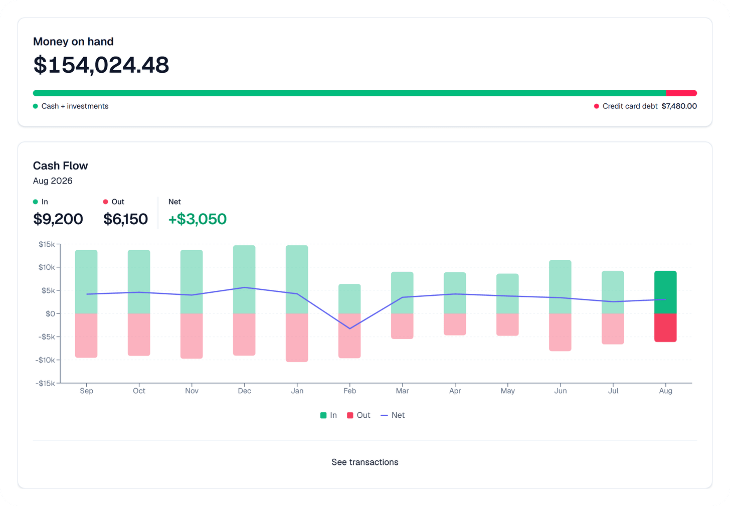
- Money on hand and Cash Flow: the dashboard now opens with what you hold today and how it moved this month, sitting above the cards you already had.
Why we built it: Most people open Synx to see where their money went, and Spend answers that. Whether your cash flow is healthy is a different question, because spending doesn't always mean the cash has left: swipe a card today and nothing leaves your account until the bill comes.
What you can do
- See what you hold: Money on hand adds your cash and your investments together. Nothing is taken off it, so it matches what you'd get reading the balances off your own accounts.
- Keep card debt in plain sight: one bar under the figure splits what you hold against what you owe on your cards, with the card balance written next to it. It sits beside the number instead of quietly coming out of it.
- Watch the trend: a small line to the right traces the last twelve months. It appears once there are a couple of days of history behind it, and leaves the space empty until then rather than drawing a flat line that means nothing.
- Read the month in three numbers: Cash Flow gives you money in, money out, and the difference between them for whichever month you're looking at.
- Move between months: twelve months sit under the figures, one column each, with money in rising above the centre line and money out hanging below it. The net runs across as a line. Click any month and the three numbers above switch to it.
- See the transactions behind the figures: See transactions under the band opens a Cash flow view on your transactions page for whichever month you were looking at. It sorts that month into money in, money out, and money moved between your own accounts, and each group total matches the figure on the dashboard exactly.
- Moving your own money doesn't count as either: a transfer from checking into savings isn't money arriving and isn't money leaving, so it stays out of both figures instead of inflating them.
- Card spending lands when you pay the card: a swipe moves debt, not money. The charge turns up in Out on the day your card payment clears, which is the day the money actually left you.
Good to know
- It isn't a net worth figure, on purpose: your bank reports what you owe on a mortgage but nothing about what the house is worth. A number built from one half of that is worse than no number at all, so Money on hand doesn't try. Mortgages and car loans stay out of it entirely.
- Money sent somewhere Synx can't see still counts: a wire to an account you haven't linked really did leave you, so it lands in Out. In the transaction view those rows say so, which is usually the answer to "why is Out higher than I expected".
- Investments drift on their own: a fund can be worth more today than it was yesterday with no transaction behind it, so In minus Out won't always account for every dollar Money on hand moved.
- The two sections stay put: they're pinned to the top of the dashboard. The cards below them keep whatever order you dragged them into.