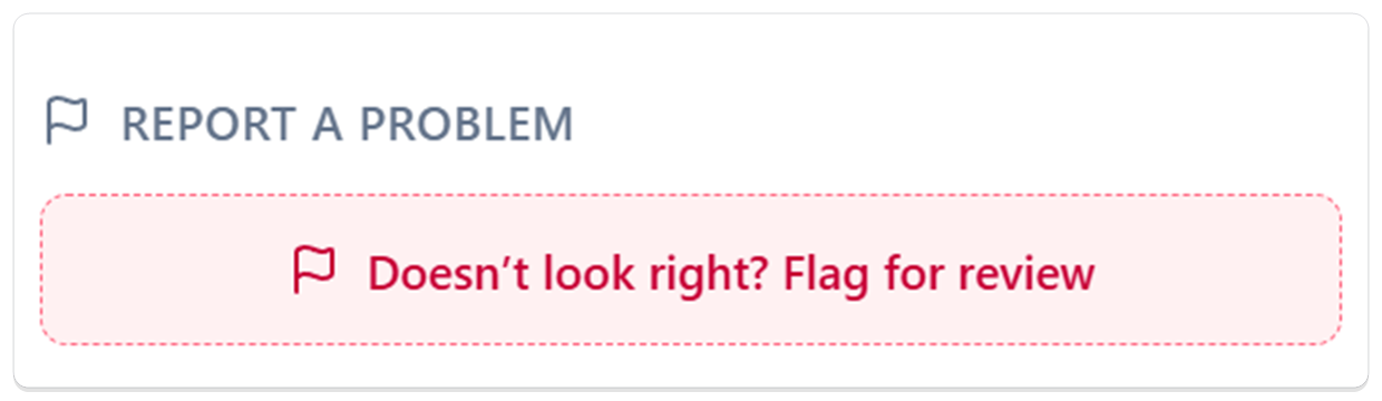
Flag a Transaction — tell us when something doesn't look right
v0.1.9🚩 Spot a transaction that's wrong, duplicated, or from the wrong store? Flag it for review in a couple of taps, and a real person on our team looks into it.
When a transaction looks wrong, you can now flag it for review right from its details, tell us what's off in your own words, and a real person on our team takes a look.
Why it matters — Bank data isn't always perfect — an amount comes through wrong, the same charge shows up twice, or a payment gets pinned to the wrong store. We take that seriously, because your numbers are only as good as the data behind them. Now, instead of shrugging it off, you can tell us in a couple of taps and we'll set it right.
What you can do
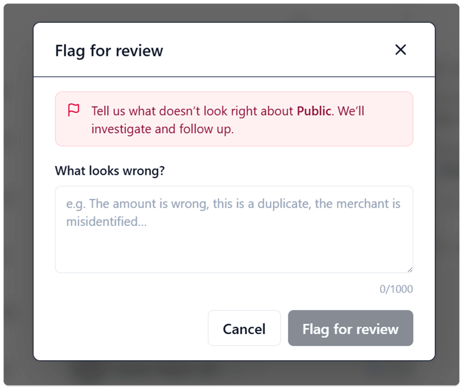
- Flag anything that looks off — Open any transaction's details, scroll to Report a problem, and tap Doesn't look right? Flag for review.
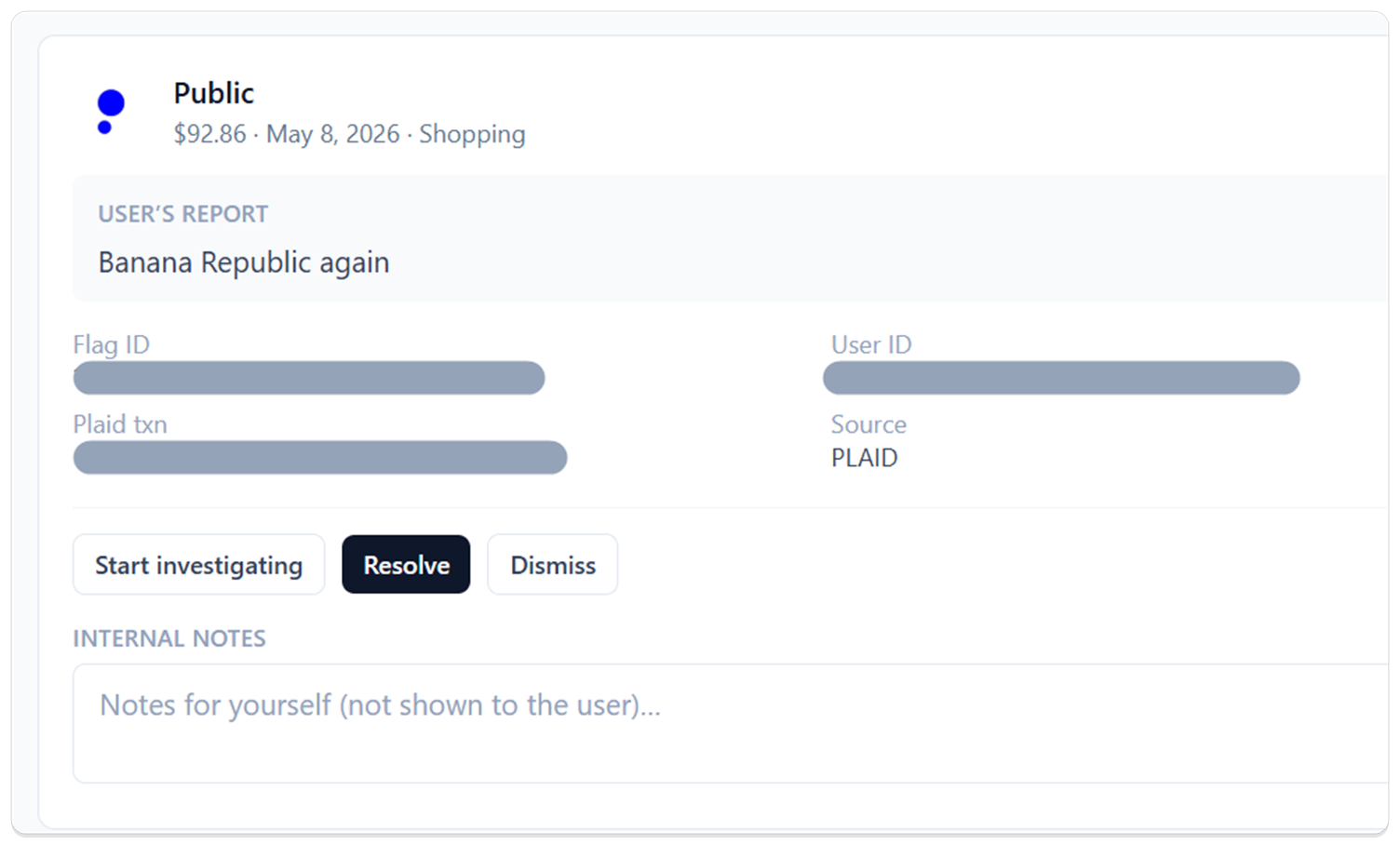
- Say what's wrong in your own words — There are no rigid categories to pick from. The box names the exact store and asks What looks wrong? — the amount is wrong, it's a duplicate, the store is misidentified, whatever it is, just type it. You've got room for a full explanation.
- Know we got it — The moment you flag it, the transaction switches to an Under review card that says "You flagged this transaction. We're looking into it." No wondering whether it went through.
- Spot your flagged items at a glance — A flag marker sits right on the transaction in your list, so the ones you've reported stand out without opening each one.
- Change your mind anytime — Tapped flag by accident, or sorted it out yourself? Withdraw flag clears the report instantly, no questions asked.
- Watch it clear when it's done — Once we've looked into it and set things right on our end, the "Under review" card goes away on its own.
What happens on our end
Every flag goes straight to a real person on our team — not a black hole. We see exactly what you reported next to the transaction, look into it, and follow up. Getting your data right is the whole job.
Good to know
- One open report per transaction — A transaction can have a single active flag at a time. If you want to add more detail, withdraw the current one and flag it again with the full picture.
- Your own transactions for now — You can flag transactions on your own accounts. Flagging something on a household member's account isn't supported yet.